Once I had decided on the logo design that I preferred, I began to experiment with different sizes and see what looked best.
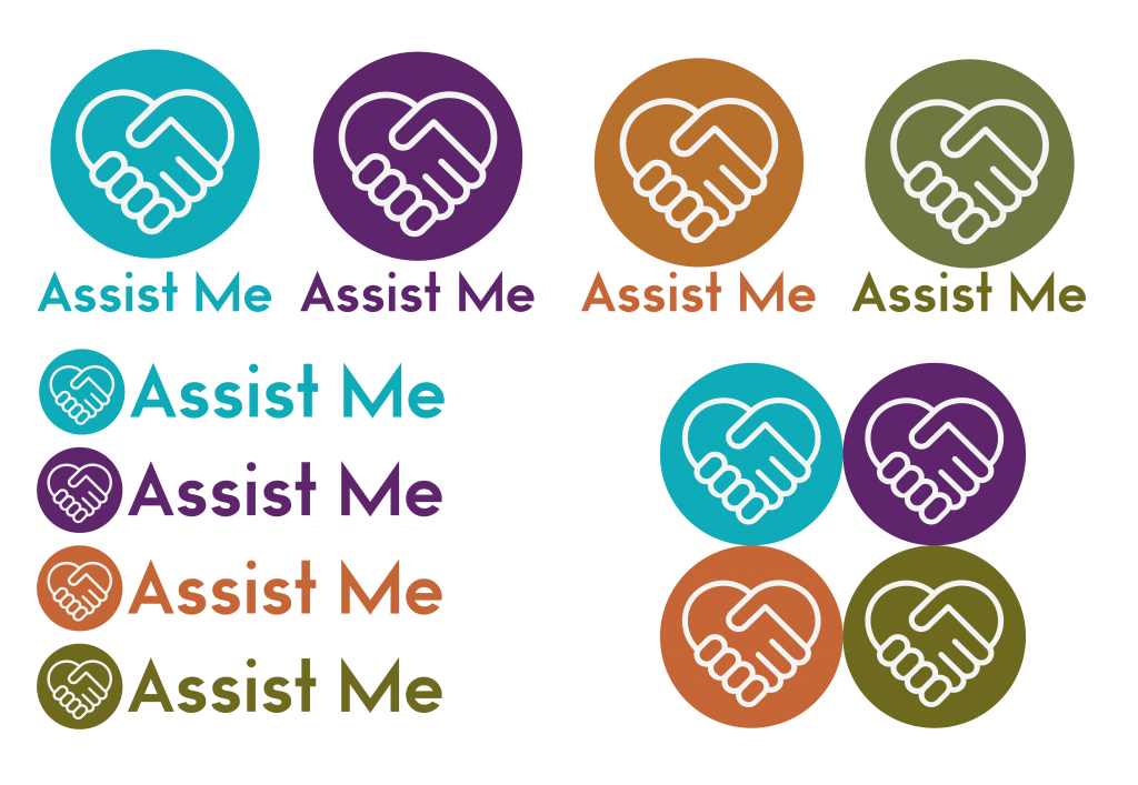
I decided to pair the application logo with the text ‘Assist Me’ too as this would be suitable for marketing material whereas the symbol only version would be the app icon on your phone/tablet screen. I used a few different layout combinations and also combined the four colour choices together to use as the home screen logo.

