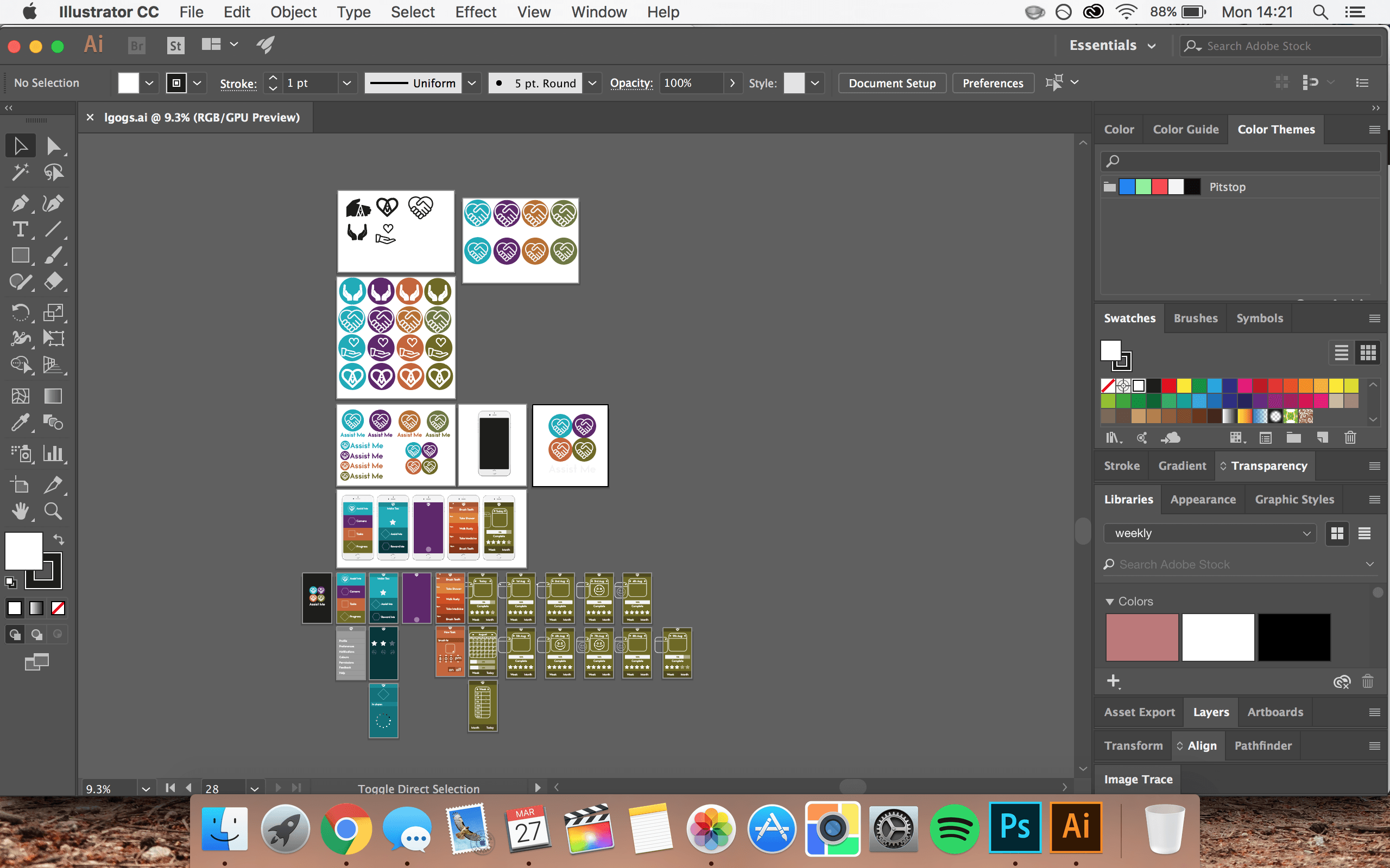
When designing my interface I started out with a blank Adobe Illustrator document and my colour scheme. Using some inspiration that I had collected on my Pinterest page. The designs I particularly liked used flat design and were pretty simplistic. This hopefully will prevent any confusion when navigating through the app whilst also remaining functional and look visually pleasing.
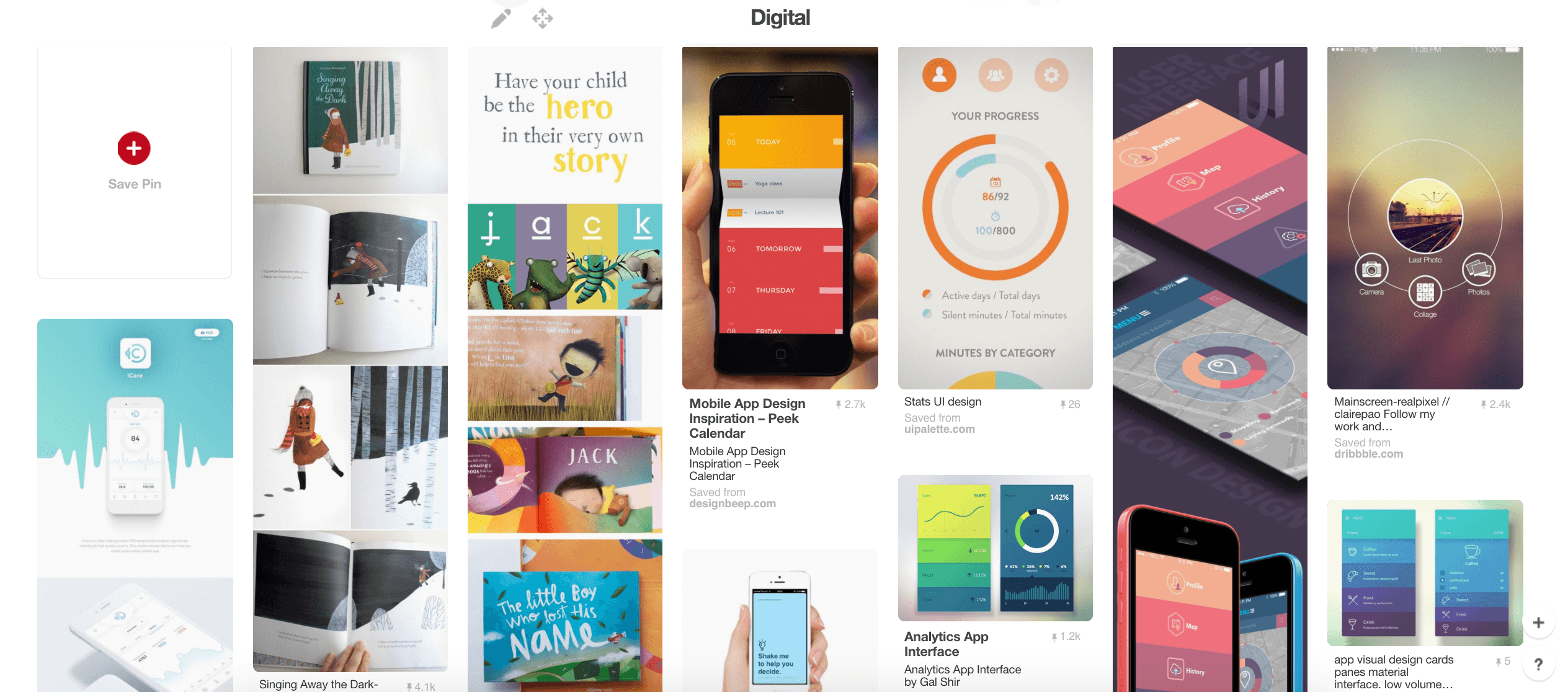
https://uk.pinterest.com/ohhitsonlyalice/digital/
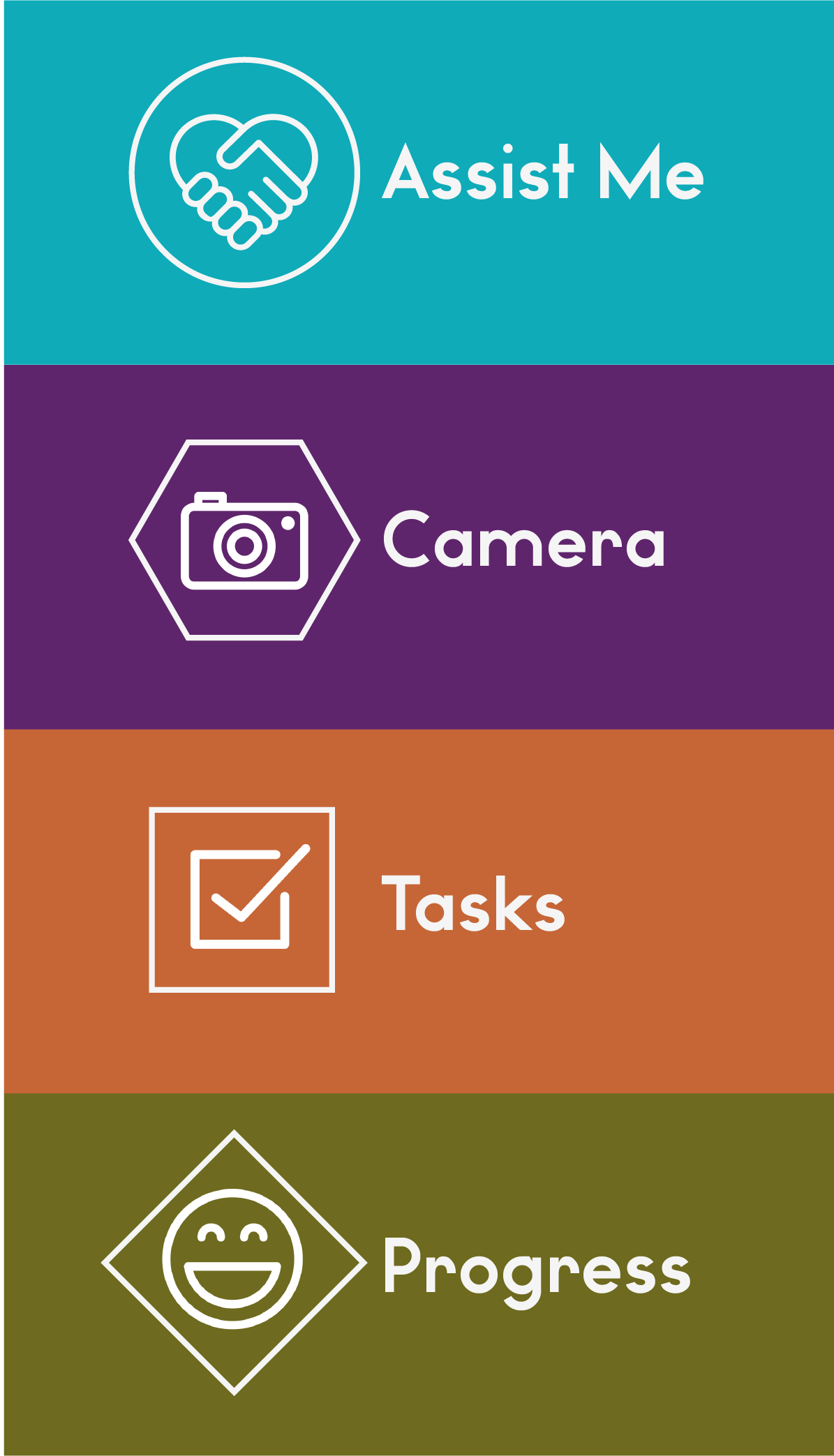
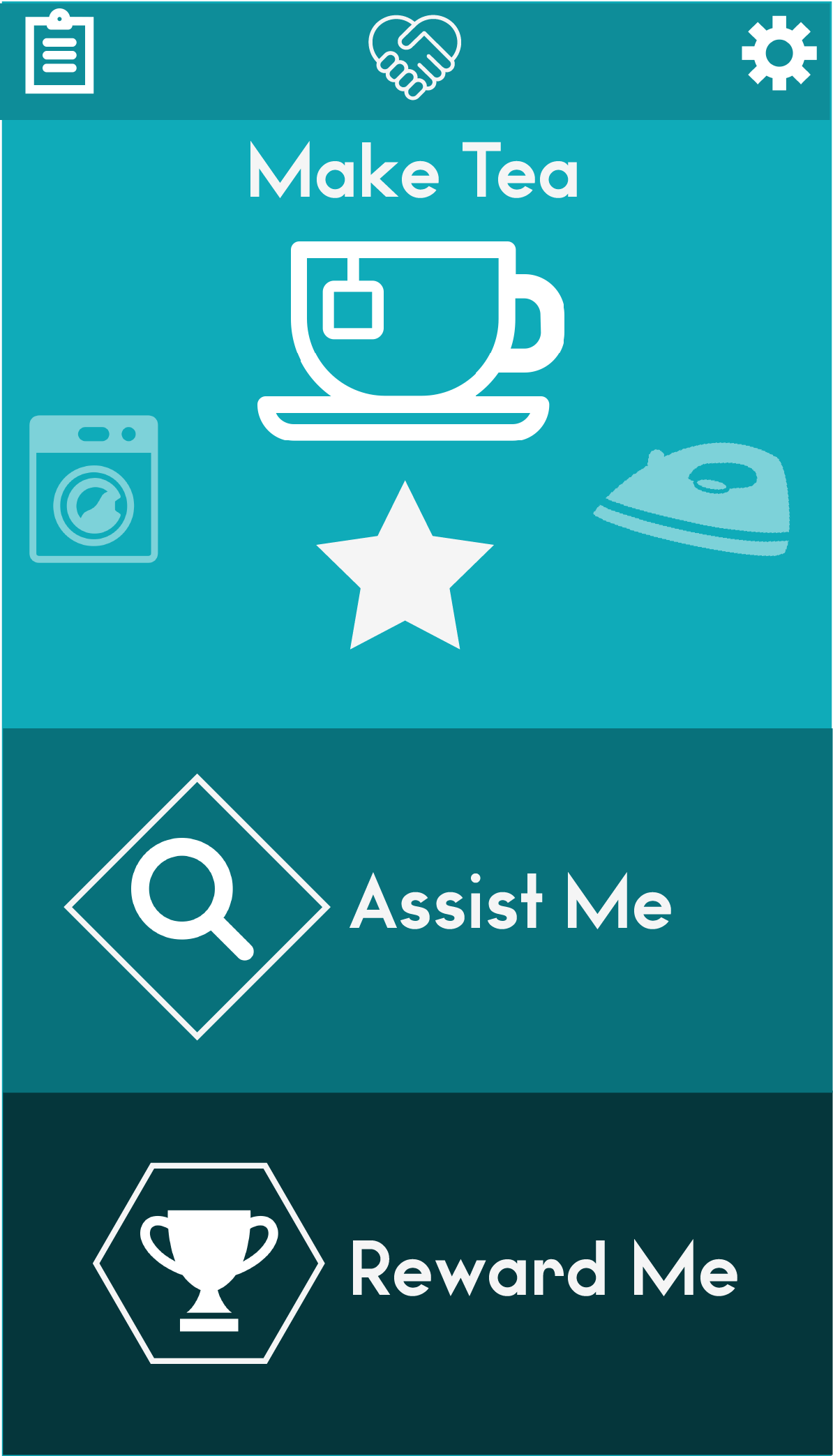
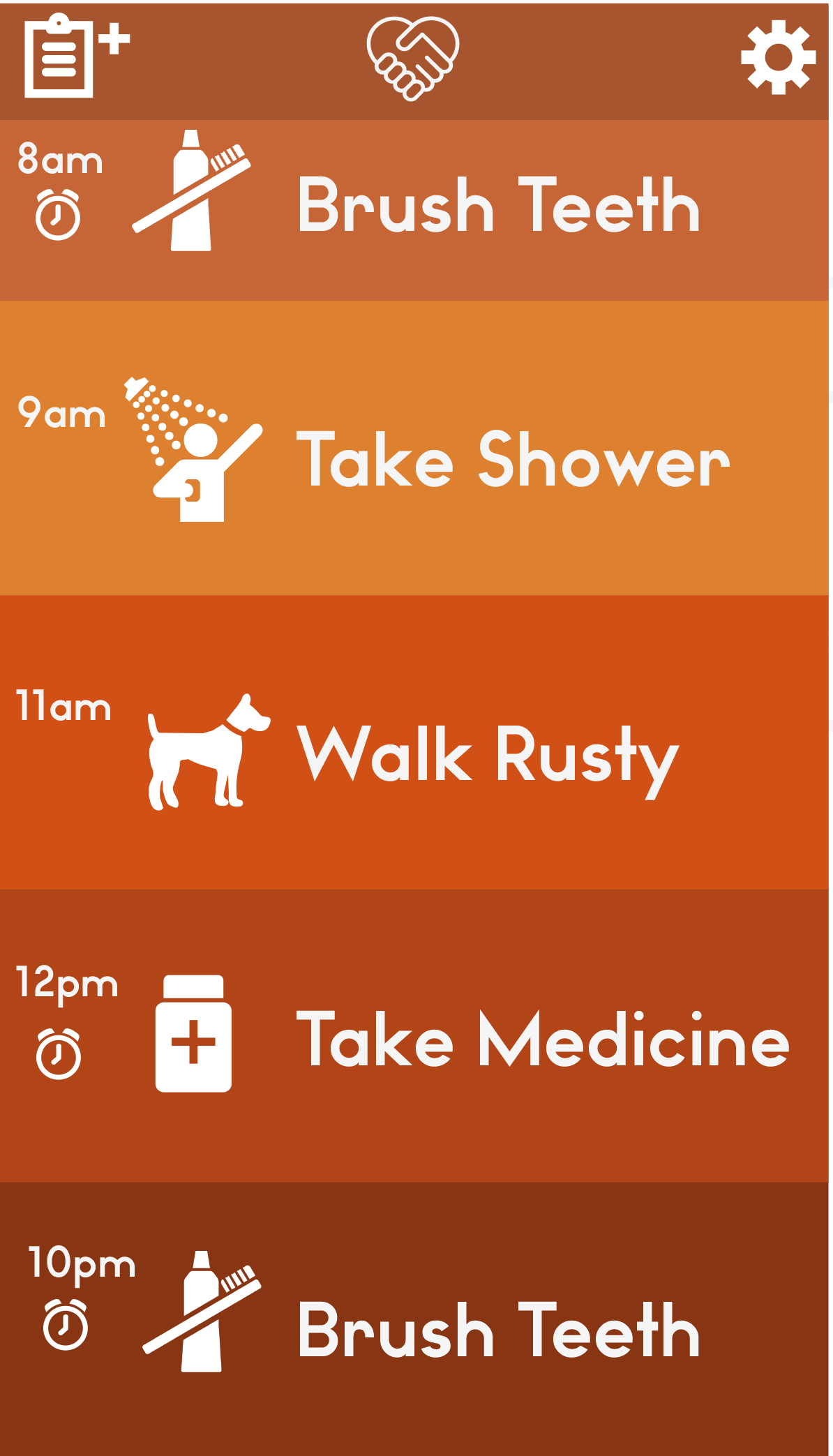
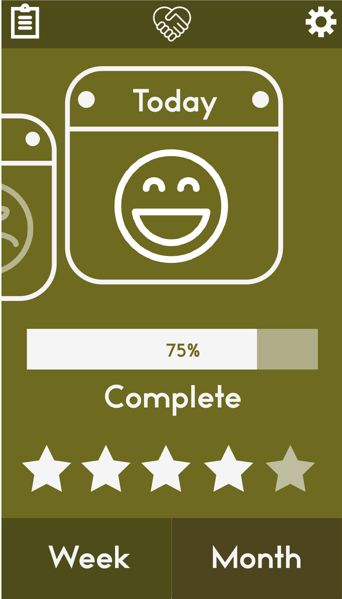
For the home screen I wanted to include the four key colours of my brand and keep this colour scheme through each different section. Each different element of the navigation corresponds to one of the four colours.
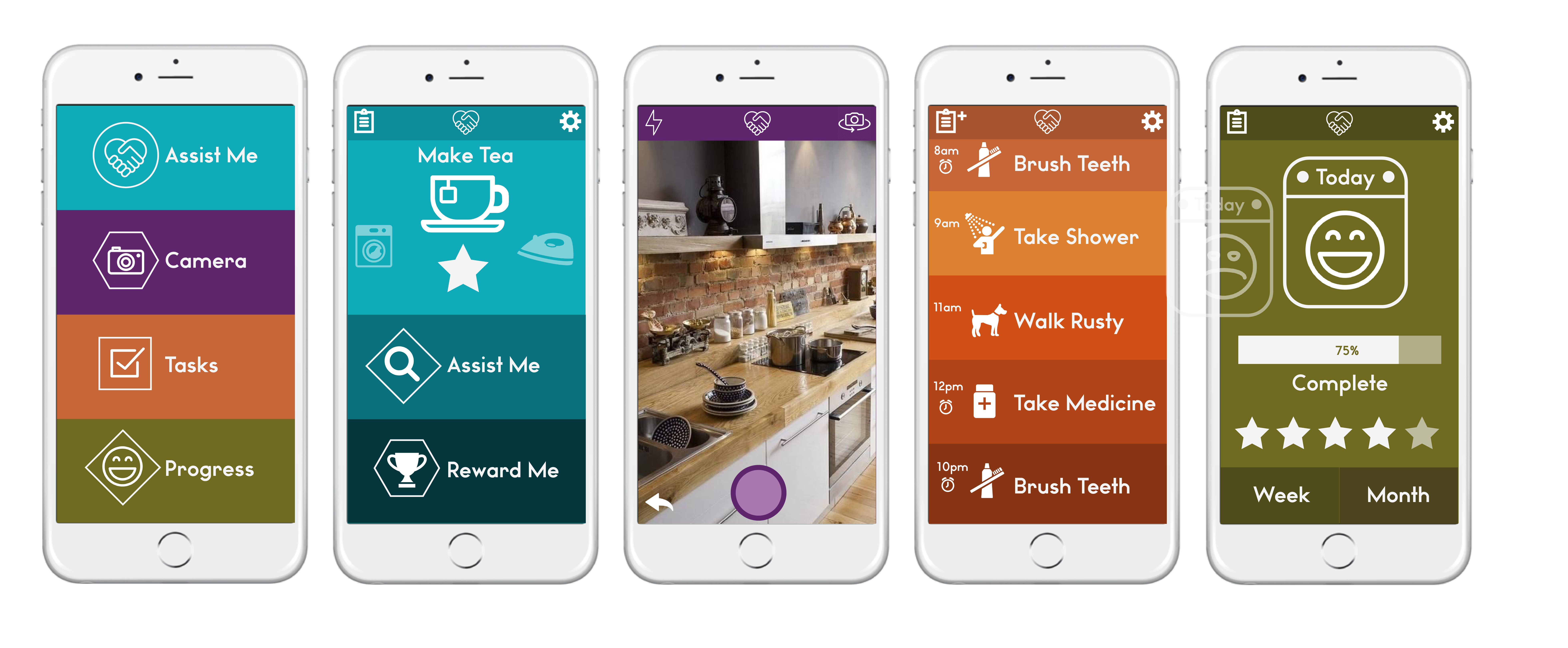
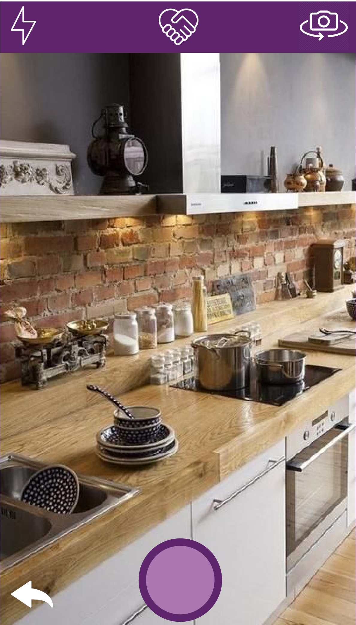
For the symbols and text, I have stuck with white so that it is easy to read and can be seen over the different coloured backgrounds. I included symbols alongside the text prompts to further enforce what that button or action means to the user. I aim to create a simple tap motion to access a page and swipe back to return to the previous page. Removing the need for any extra buttons.
Leave a comment