Development and Final Ideas

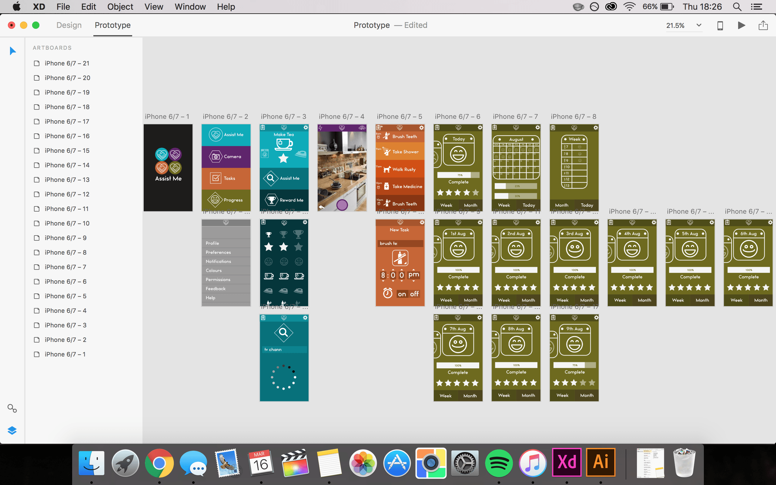
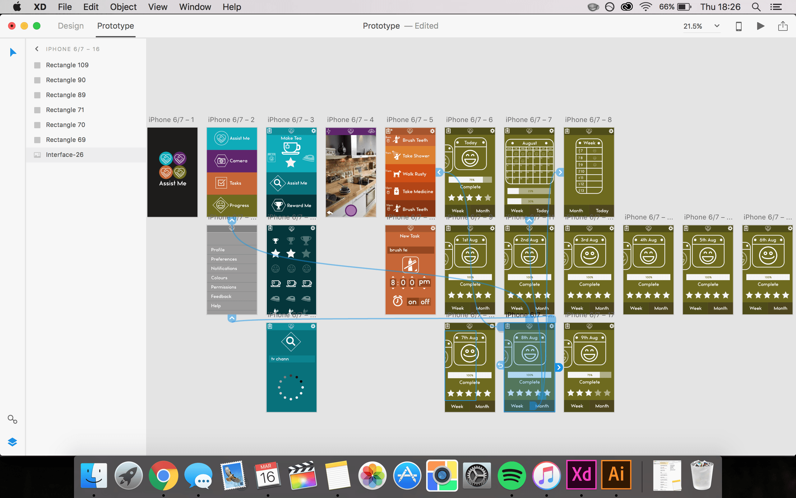
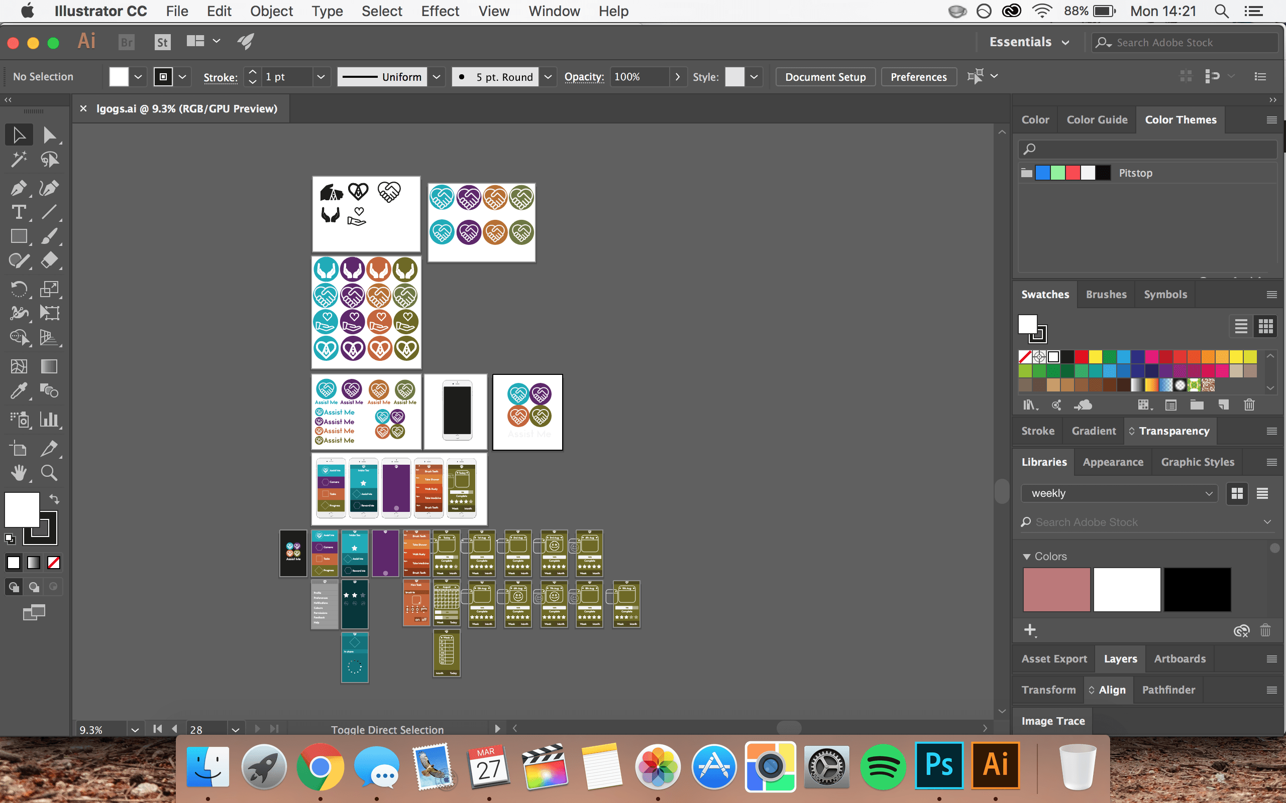
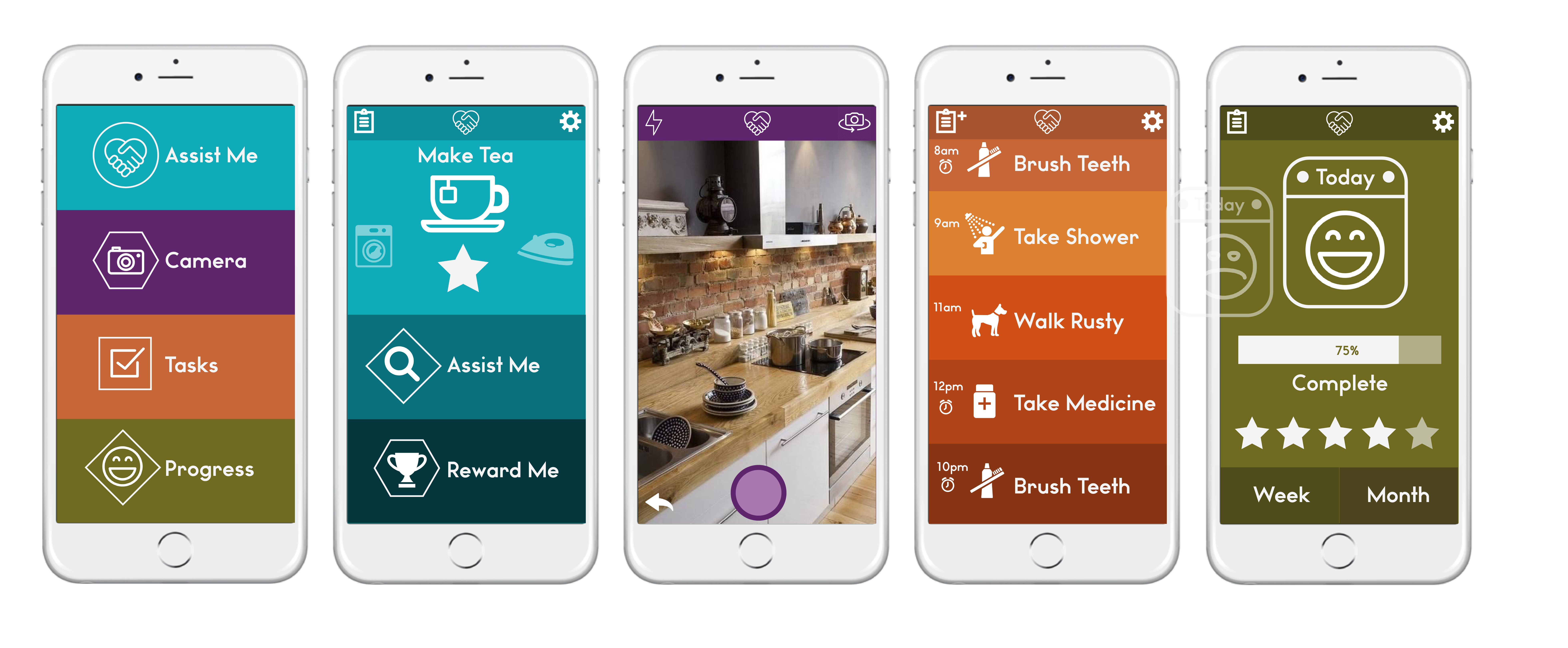
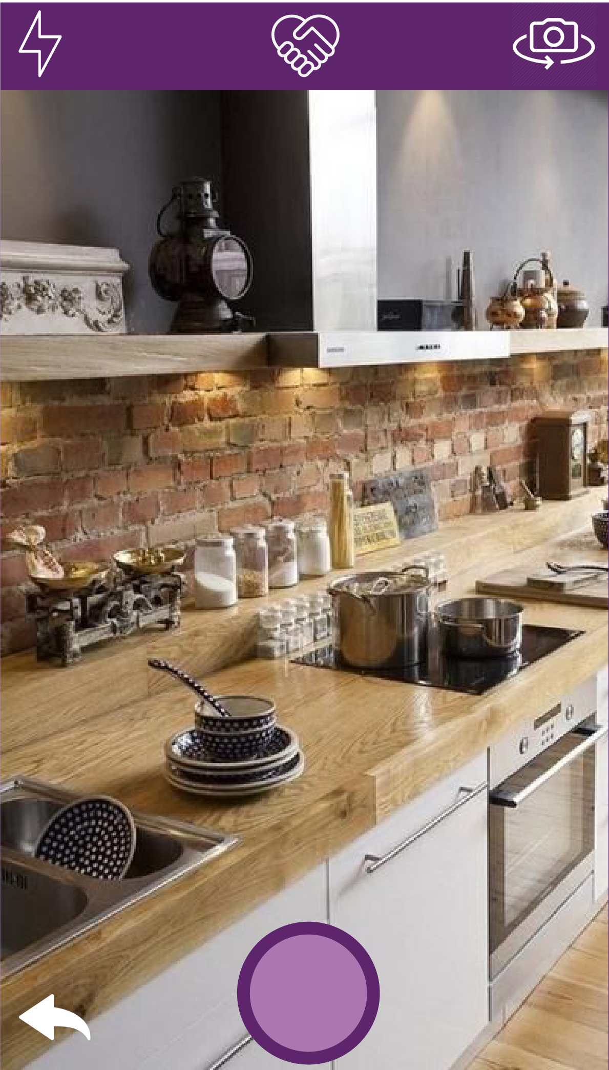
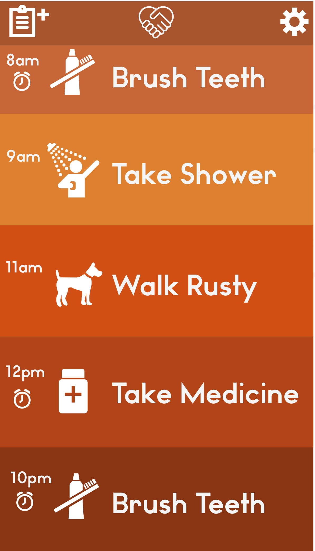
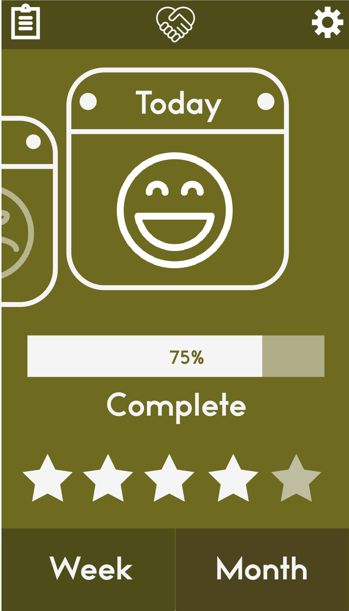
After creating a prototype that could be navigated I decided to use a screen recording software to create a little demo animation of the app in use. This would be good to use for promotional purposes or to send off to anyone who may want to fund the project as it really allows you to visualise what the app would look like and how it would function.

I would like to incorporate this demo into an animation that could be used for advertisement purposes. The ad will show a short little snippet into what the app can do and hopefully interest any potential users in downloading in and giving it a go.

If my time frame allows it I would also like to create an example animation that would play in the app to help instruct the user to give people an idea of the in-app animations and how they work too.

Adobe XD Prototype

After creating a number of different screens for Assist Me, I decided that it would be beneficial to see these in use and make a working prototype so I can make any further adjustments. I imported the 21 various screens into Adobe XD and linked them all together using different commands and movements. I was then able to open my prototype on my phone to test it out ‘for real’ and see how the interface works.


Screen Shot 2017-03-16 at 18.26.10 Screen Shot 2017-03-16 at 18.26.25


TRY DEMO HERE

Interface Design

When designing my interface I started out with a blank Adobe Illustrator document and my colour scheme. Using some inspiration that I had collected on my Pinterest page. The designs I particularly liked used flat design and were pretty simplistic. This hopefully will prevent any confusion when navigating through the app whilst also remaining functional and look visually pleasing.

Screen Shot 2017-03-27 at 14.14.22

https://uk.pinterest.com/ohhitsonlyalice/digital/

Screen Shot 2017-03-27 at 14.21.58

For the home screen I wanted to include the four key colours of my brand and keep this colour scheme through each different section. Each different element of the navigation corresponds to one of the four colours.

Interface-05

For the symbols and text, I have stuck with white so that it is easy to read and can be seen over the different coloured backgrounds. I included symbols alongside the text prompts to further enforce what that button or action means to the user. I aim to create a simple tap motion to access a page and swipe back to return to the previous page. Removing the need for any extra buttons.


Interface-12 Interface-07 Interface-08

Interface-09 Interface-10 Interface-11


Logo Development

Once I had decided on the logo design that I preferred, I began to experiment with different sizes and see what looked best.


Interface-02

I decided to pair the application logo with the text ‘Assist Me’ too as this would be suitable for marketing material whereas the symbol only version would be the app icon on your phone/tablet screen.  I used a few different layout combinations and also combined the four colour choices together to use as the home screen logo.

Interface-03

Initial Logo Ideas

logos-04


For my initial idea I knew that I wanted to use a key symbol that would become recognisable and distinguish the app from others. I wanted to keep in with the name of the application ‘Assist Me’ and use something that represented helping someone out or offering a helping hand. I drafted up some initial ideas using Adobe Illustrator so that I could see them before choosing a few to develop further.


I picked out my preferred four logos, with some help from my peers, and I duplicated them using my chosen colour theme so that I could see how they would be represented across different platforms.

After a discussion with my tutors and peers, I decided that the second logo was my preferred one because it has two hands and forms the shape of a heart. I think this represents the app ‘Assist Me’ well and it isn’t to complex so can be easily viewed across different mediums.