Research
For this in-app animation I first need to gather some ideas and look at similar existing animations.
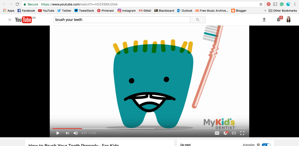
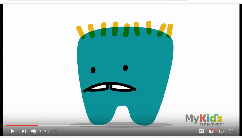
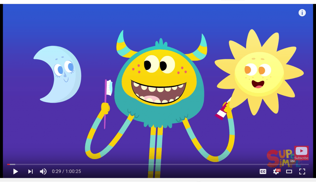
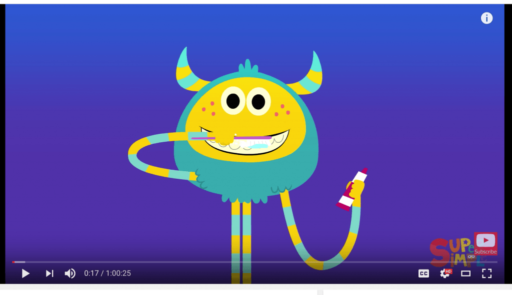
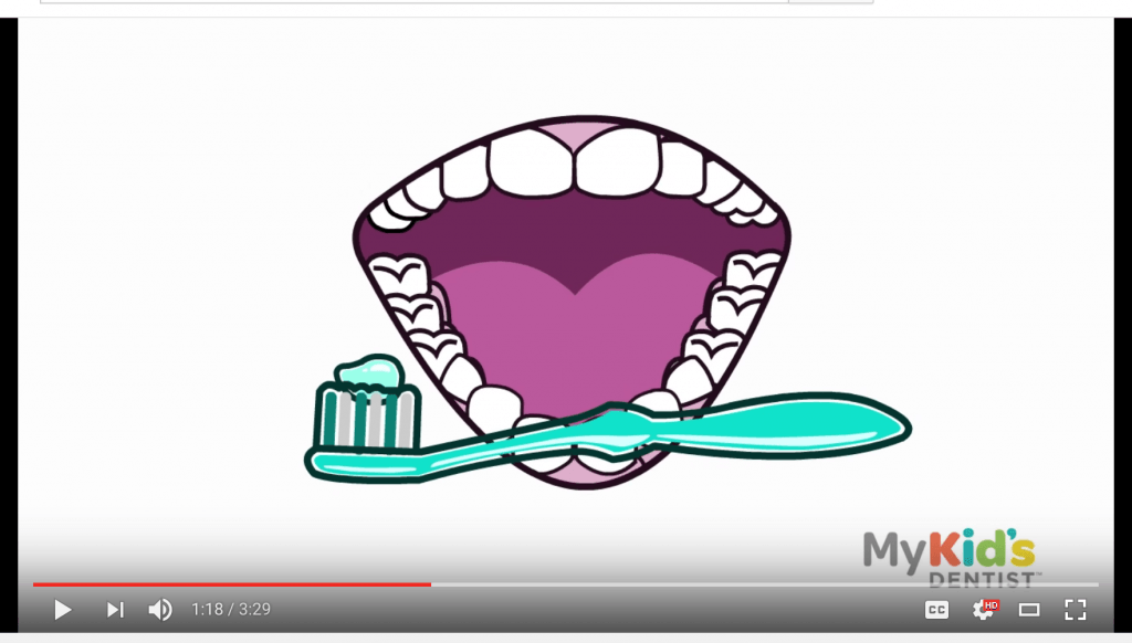
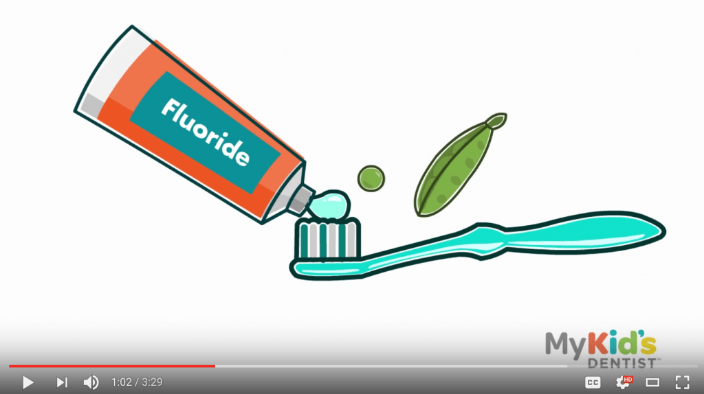
After looking online for different examples I did notice that the majority of the instructional animations were directed towards children. However, because my app isn’t solely for a child I wanted to ensure that it appealed to a wide range of ages without patronising or confusing anyone.
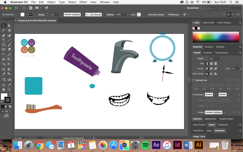
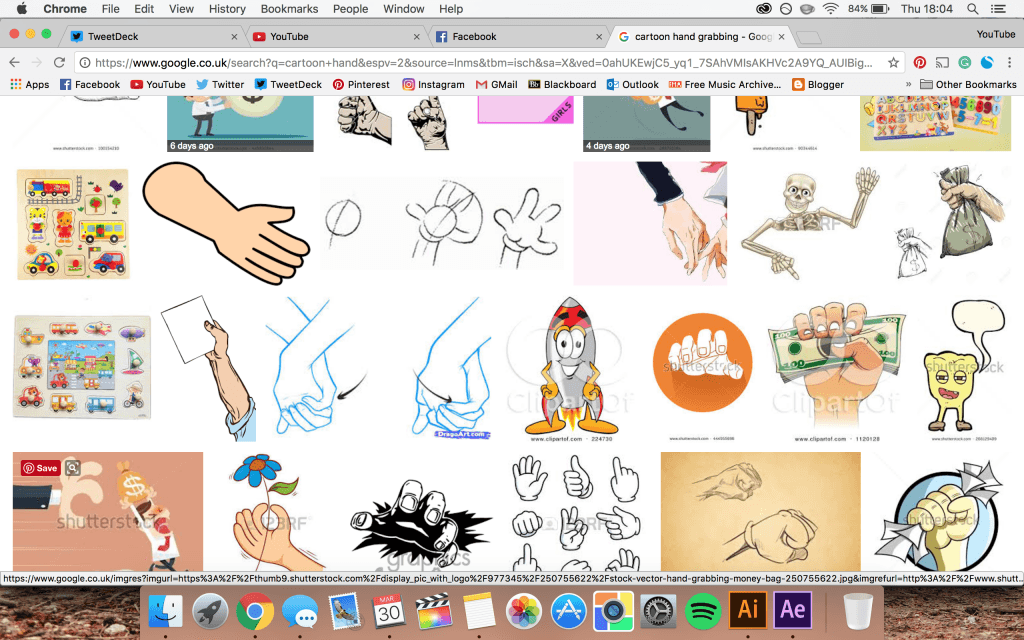
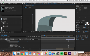
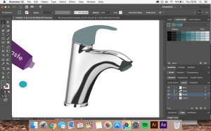
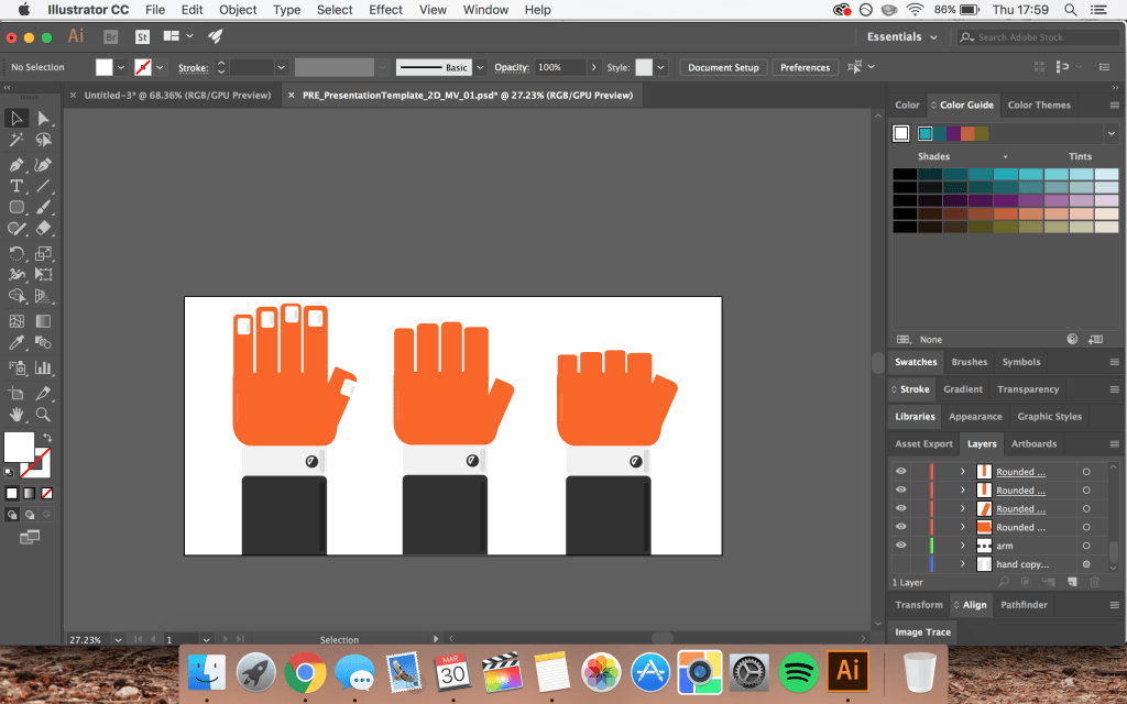
I worked to create an asset file that would house the various different elements that I need to make my animation. I looked online for existing artwork to use as inspiration and used the pen tool in Adobe Illustrator to create my own vectors and adapt them to suit they style I needed.
I decided to keep the animation simple and use block colours so that it tied in with the design of my app interface.
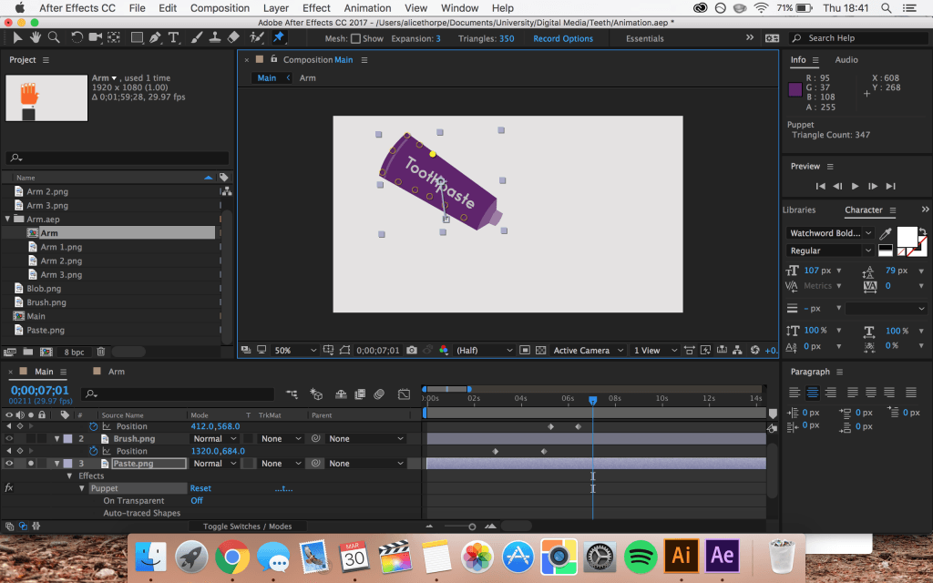
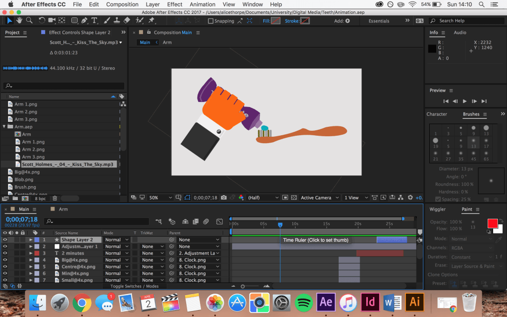
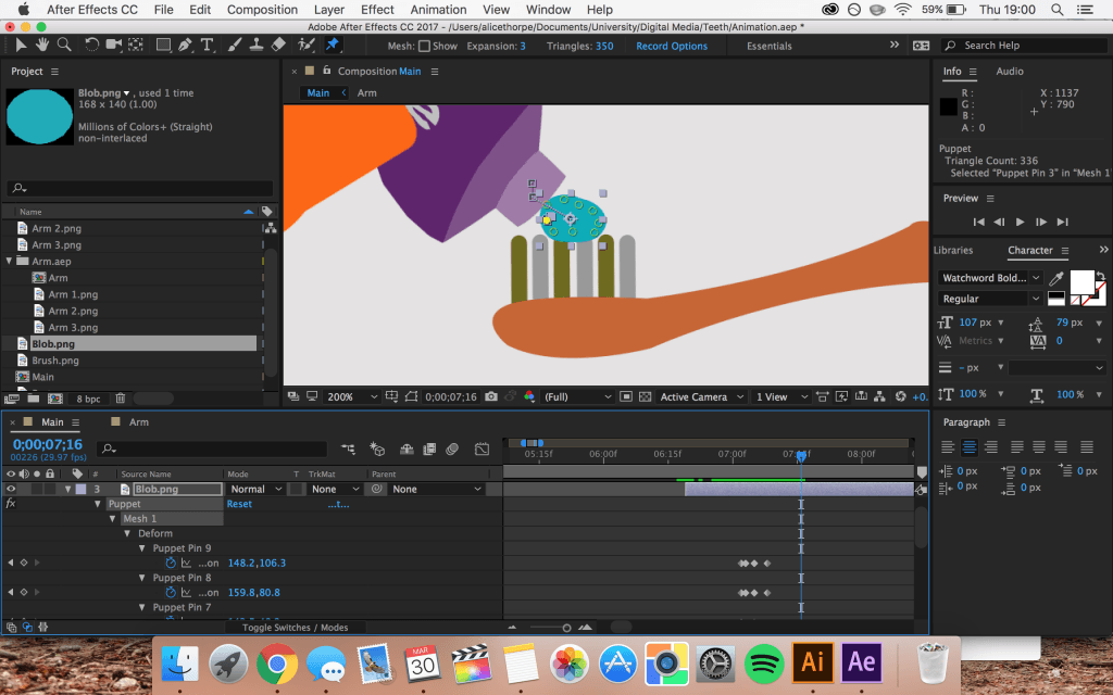
The hand template is the same one that is used in the promotional advert. However, I added more fingers and duplicated it to give the effect of the hand making a fist to squeeze out the toothpaste. Using Adobe After Effects I structured the different elements that I had created, in the order that I wanted and got to work on animating them all to work together. I used the puppet tool to mould the toothpaste tube into the hand so that you see the effect of it being squeezed as the fist closes.
I used the same puppet tool to manipulate the blob of toothpaste as well as the bristles of the toothbrush in time with the brushing motion.
I added some music to the animation which can be muted if needed, I was originally going to add a voiceover to the animation too, however, I didn’t want to come across too patronising so decided to leave it out. If I decide to add this further down the line it’ll be relatively easy to add.
Leave a comment