Reflection

In reflection of this project, I am very pleased with the outcome that I achieved, however, there are some things that I would like to improve on if I were to complete this again. My initial idea was to create a media product that would effectively assist both children and adults who have memory loss or learning difficulties, that struggle with everyday tasks. The aim was to create a product that could be tailored to suit individuals personal needs and record their progress. Whilst enabling them to gain independence and develop a sense of achievement. I wanted to make sure that this product would appeal and be useful to a wide range of people so that it is widely accessible. I also wanted to look at the possibility of including a rewards systems and an admin login for parents / carers to set and monitor various tasks.

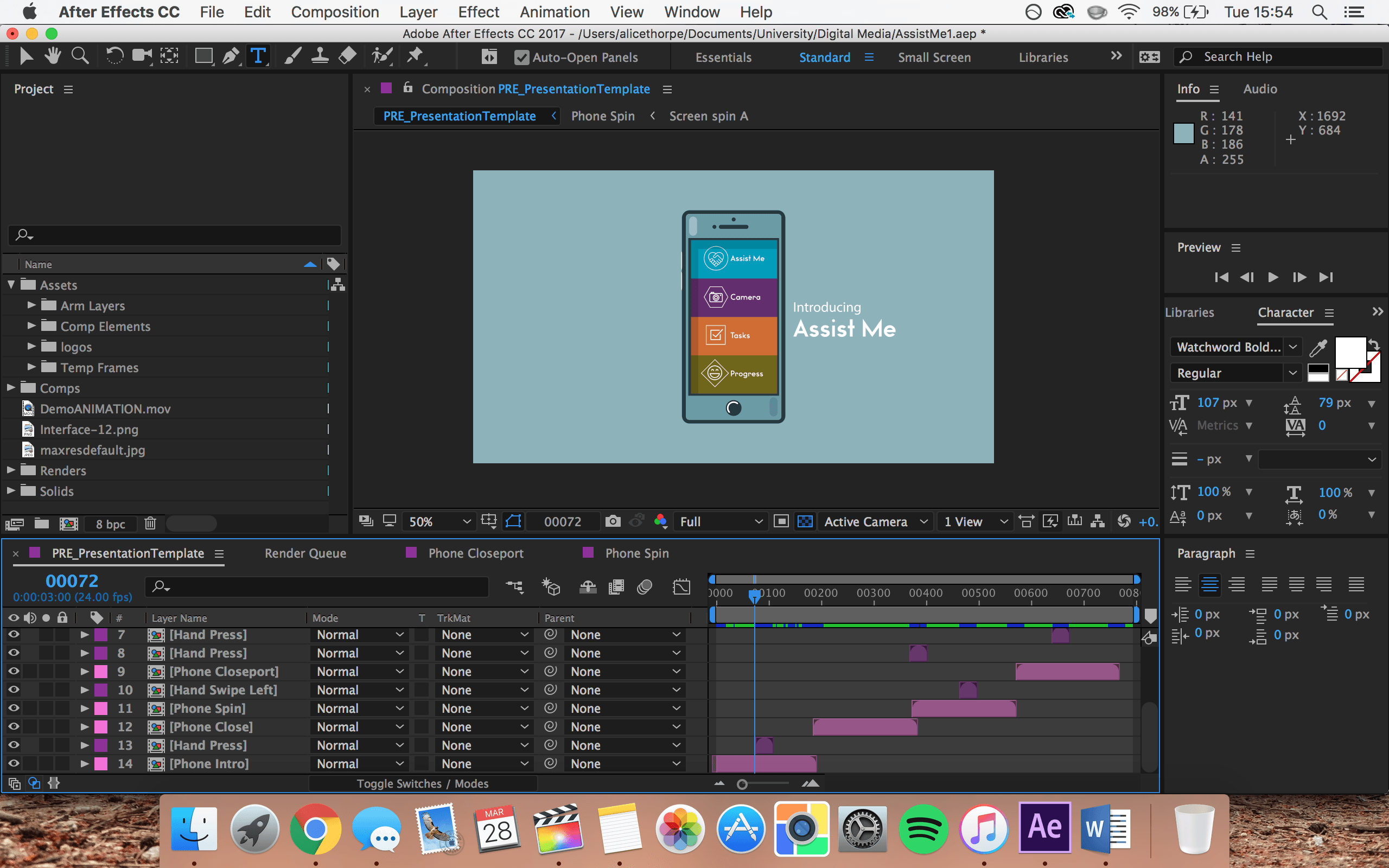
Due to the topic that I decided to follow for this project, I needed to conduct significant research in order to gain enough information and knowledge before starting. I wanted to make sure that this would help people rather than hinder them so wanted to ensure that it was simple to use and offered helpful tips and reminders throughout. To do this I decided to interview some people who have contact with individuals that may benefit from this media product. From this feedback, I was able to further my development and keep their comments in mind when designing and building the interface. I decided to stick to a simple colour theme that tied in with the logo and was bright but still easy on the eye. I wanted to avoid it looking too clinical, or in contrast, too childlike. I feel like I was able to find a good balance in the design and managed to develop a simple, effective and aesthetically pleasing interface.

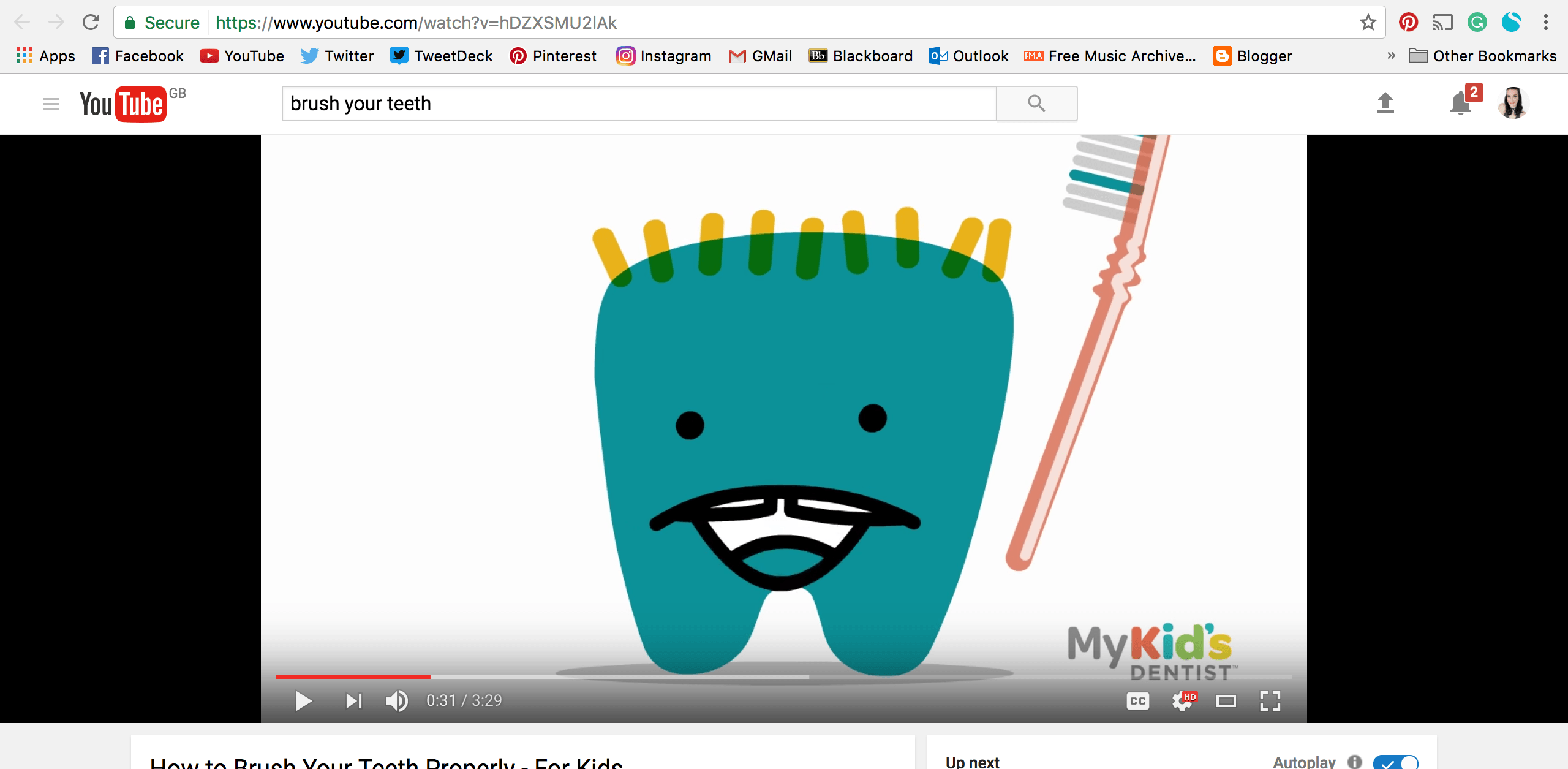
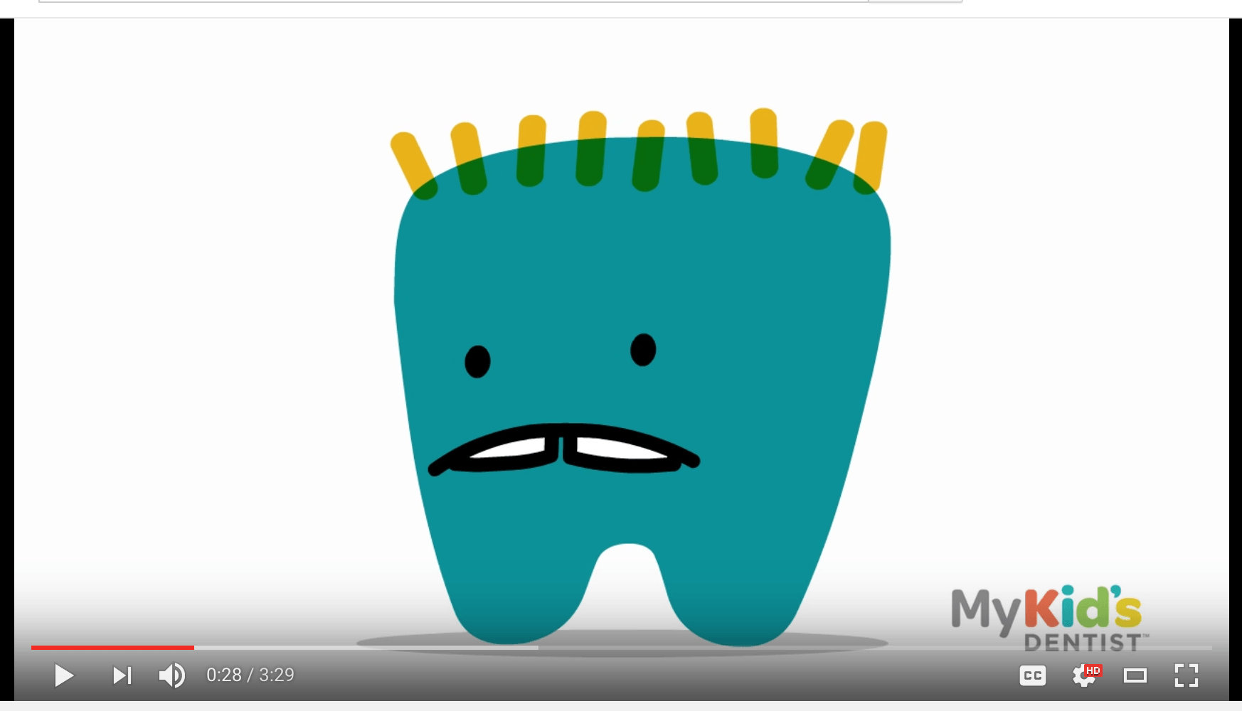
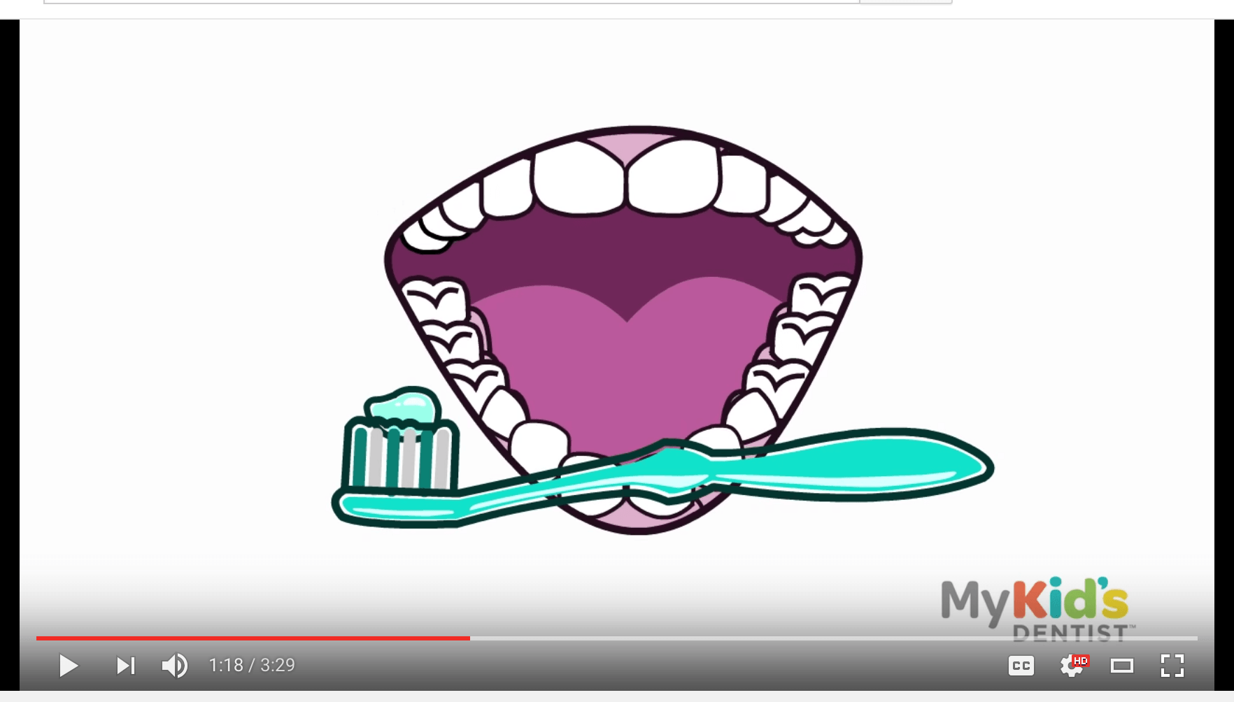
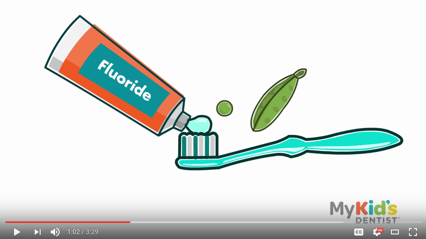
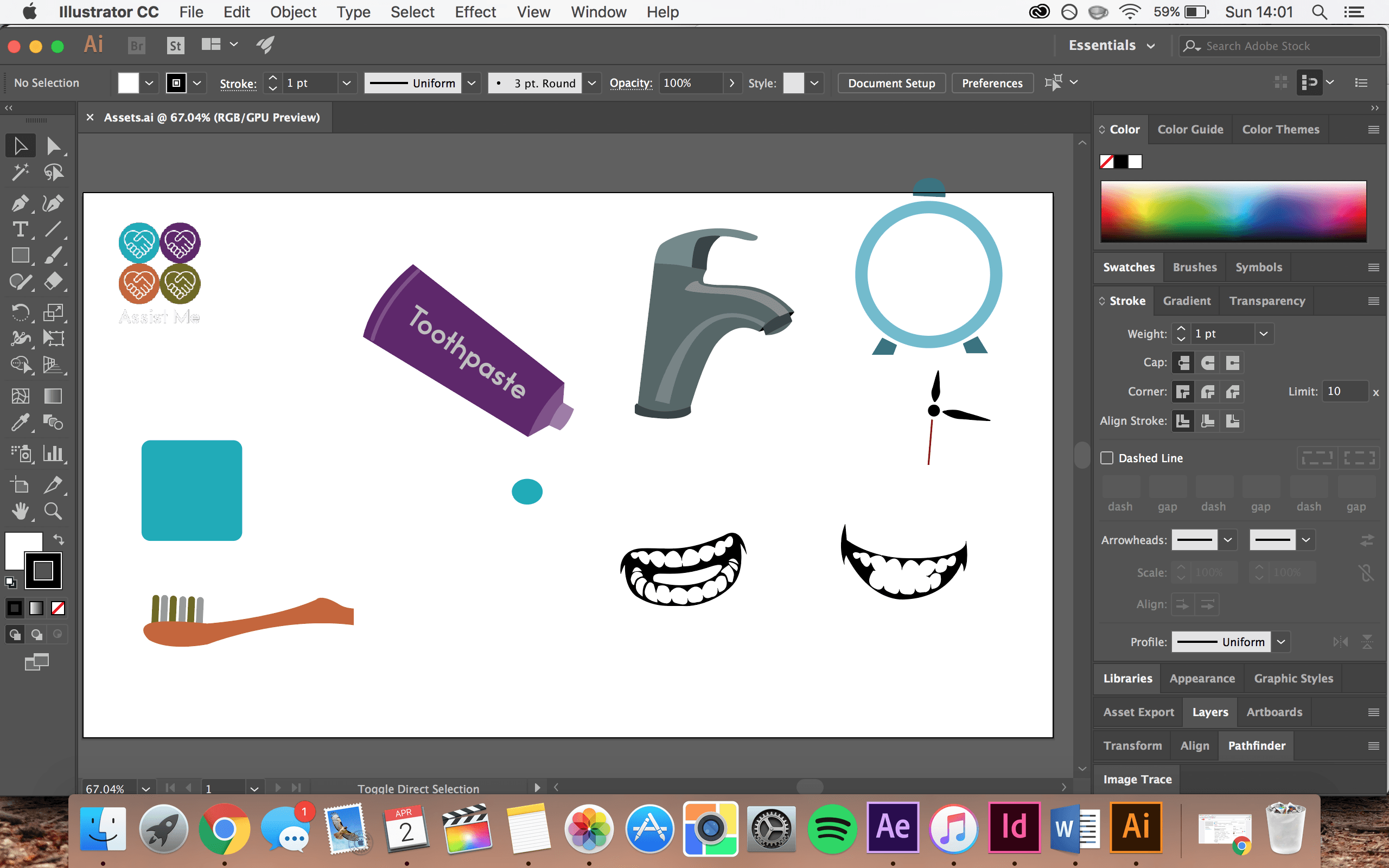
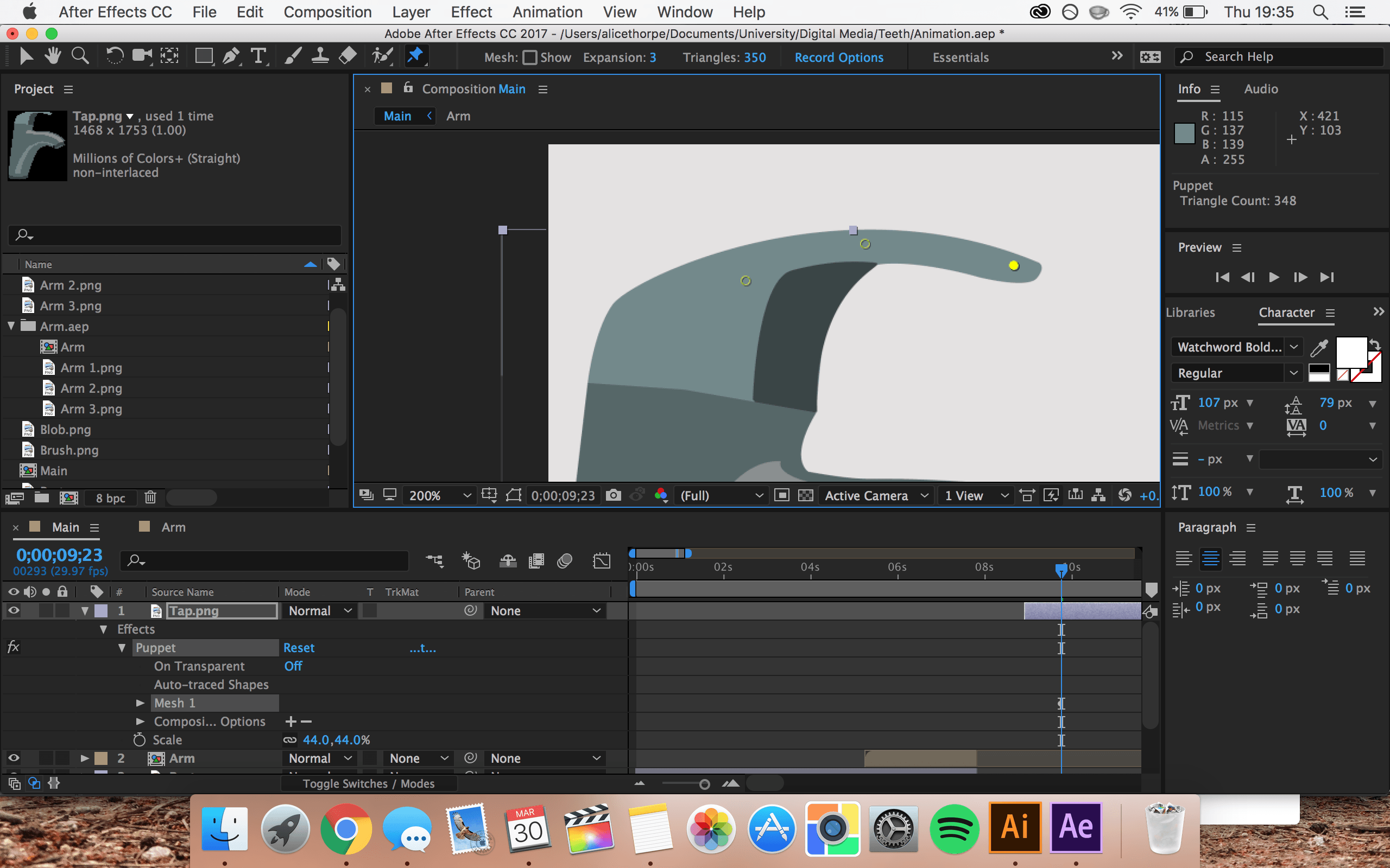
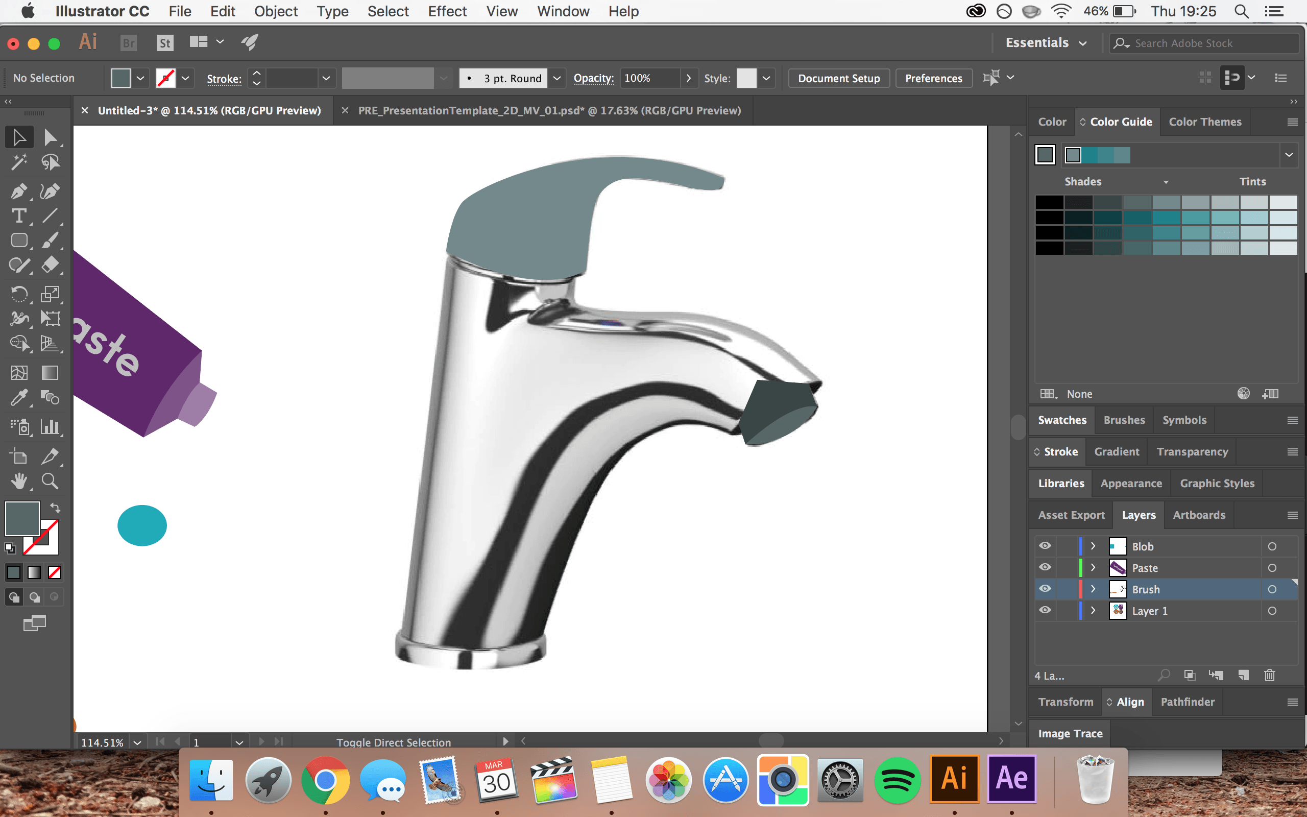
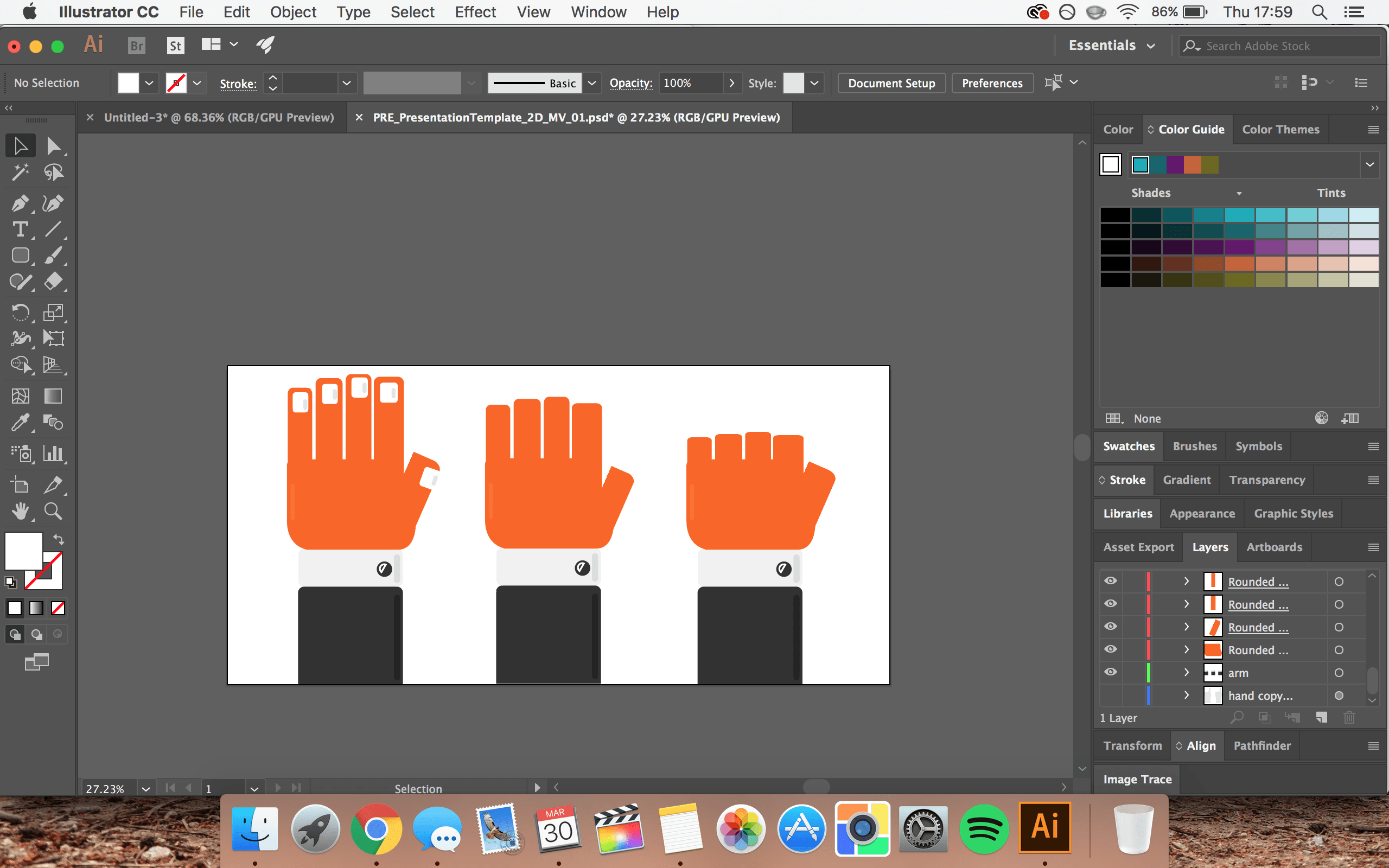
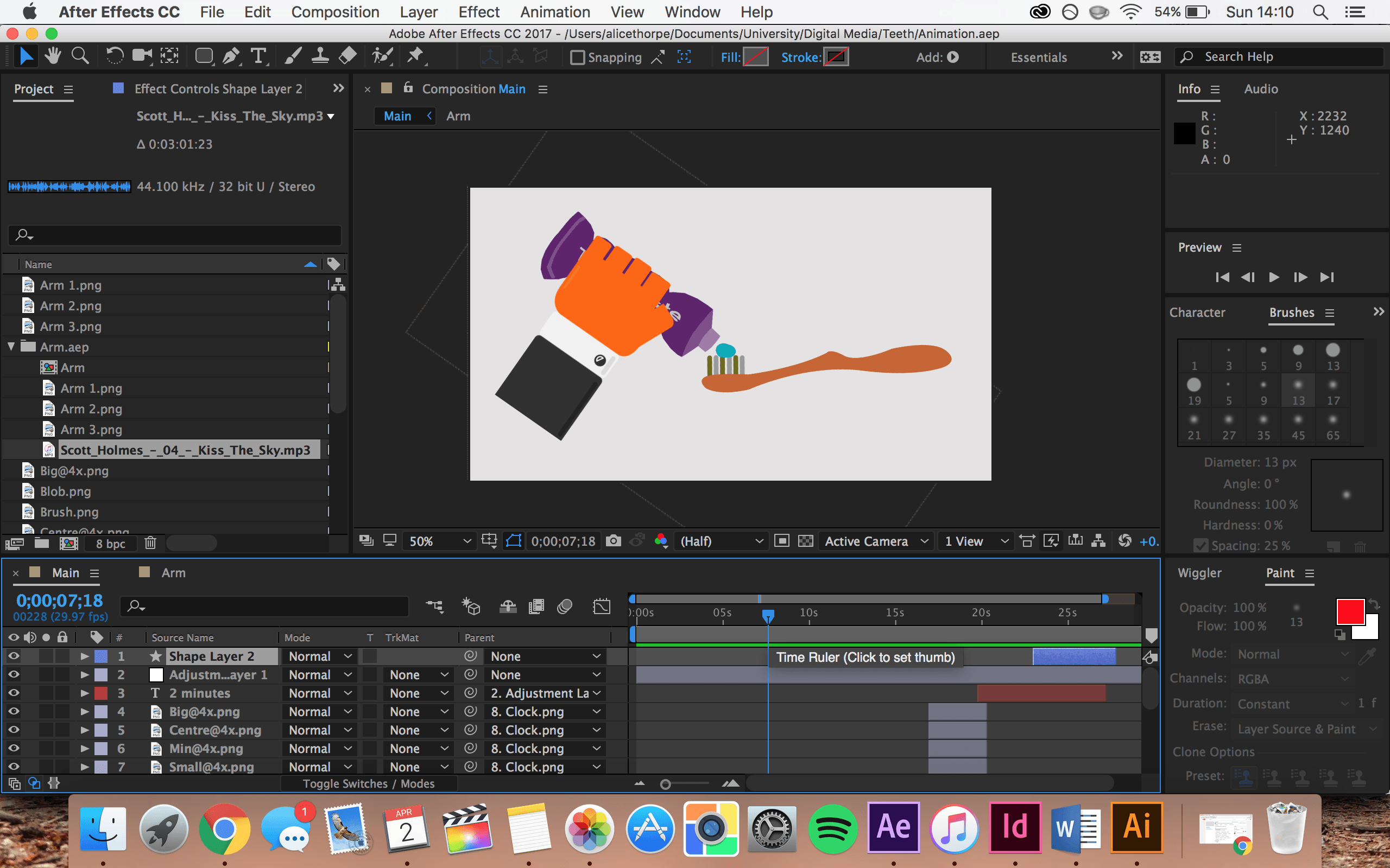
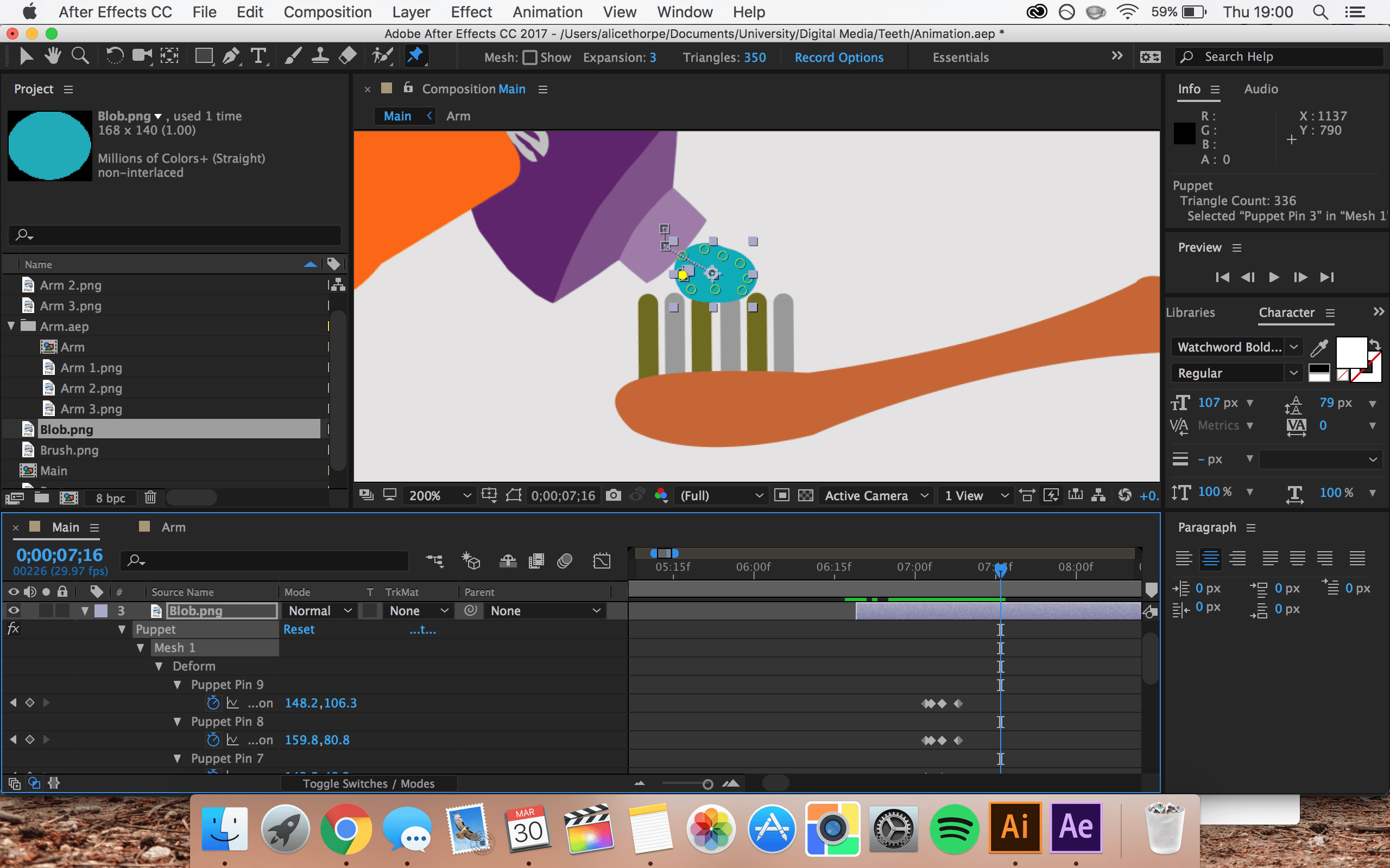
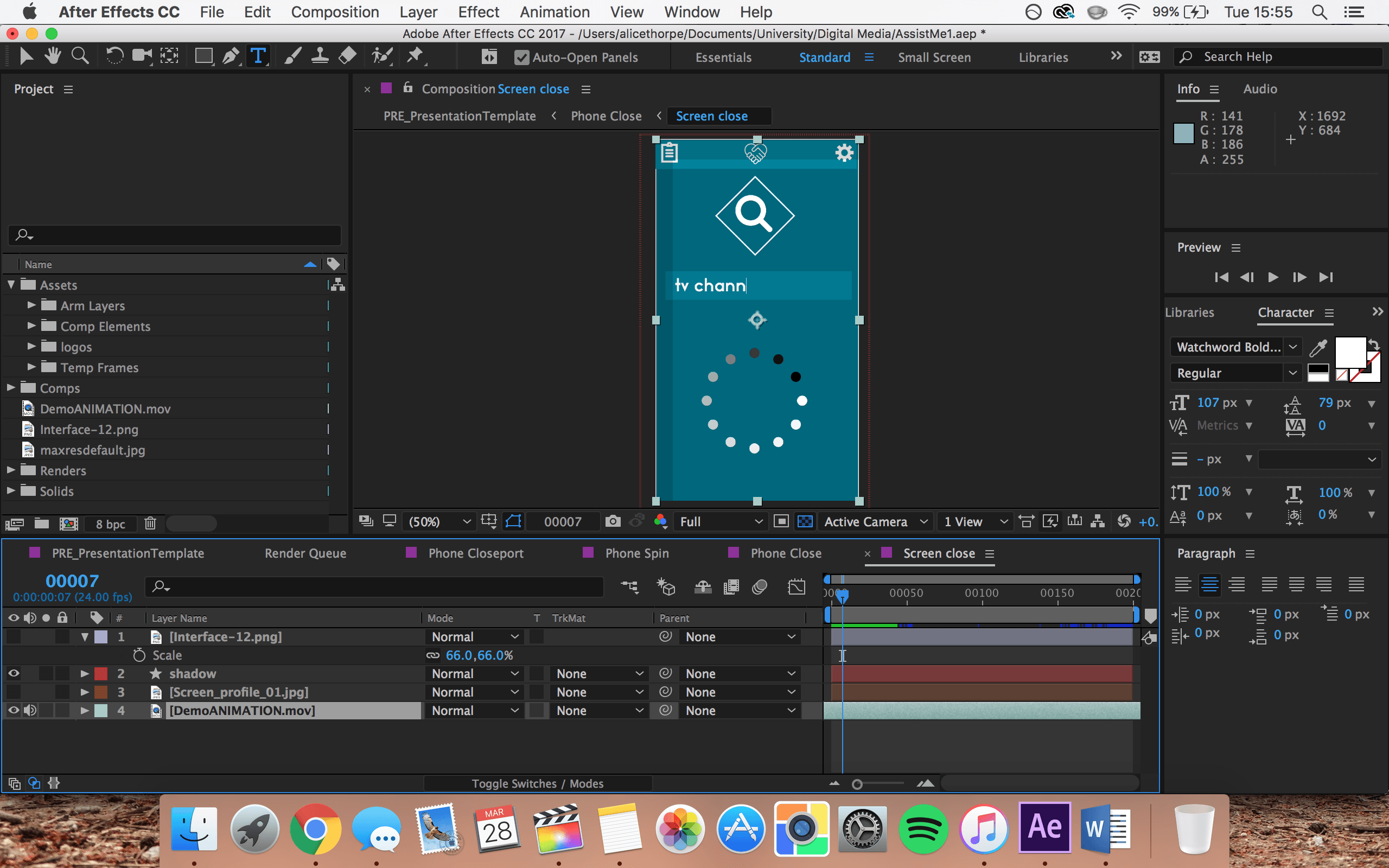
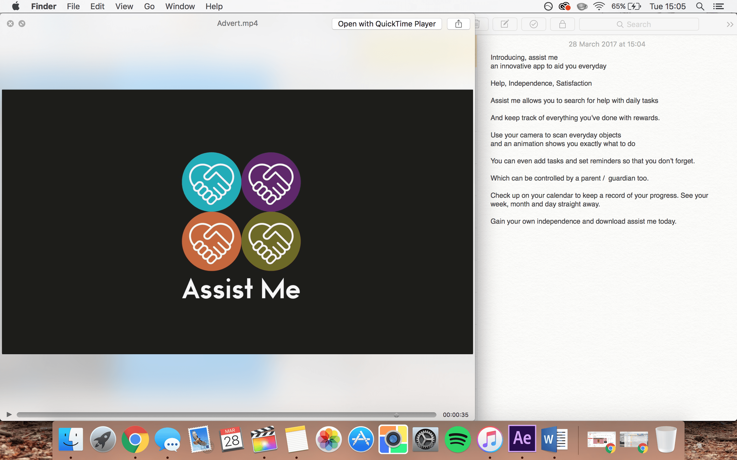
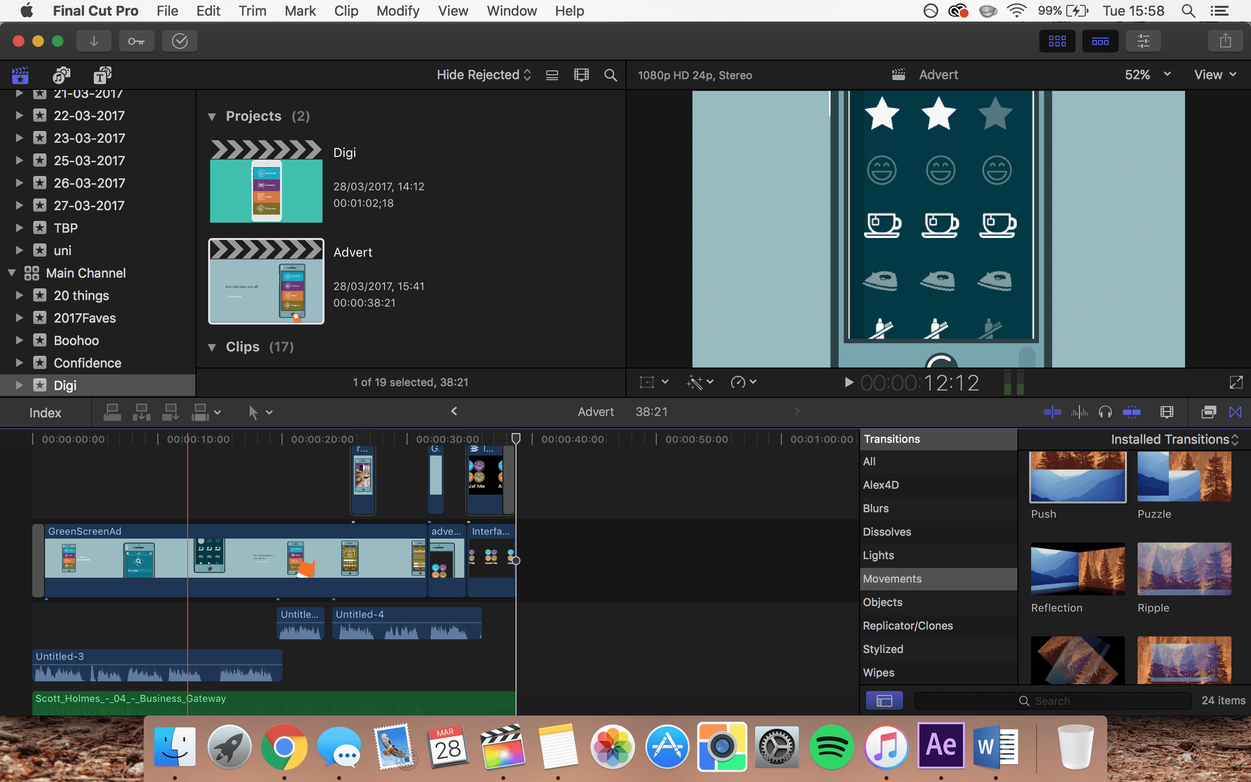
I enjoyed the challenge of designing the app and various different components to it as it allowed me to use a variety of different skills that I had a chance to develop in Semester A and really put them to practice in a ‘real world’ situation. When deciding on the design I wanted to use a simple layout that used symbols to further enforce what each function means. Alongside the interface design, I was able to create a demo reel of the app in use. I then integrated the demo into an animated advertisement that could be used to promote the application when encouraging users to download or when applying for funding. And finally, I was able to create an example animation of brushing your teeth, that would play as an instructional video within the app itself. Ideally, I would have liked to make a short showreel of the app in use, using real life actors and possibly using motion tracking to apply the app to their phone screens. If I were to complete this project again I would account for the time needed to complete this additional element.

Overall, I believe that I completed the core aims of my product successfully and really did manage to convey its meaning and demonstrate how it would work and could help individuals.

Example In-App Animation

Research

For this in-app animation I first need to gather some ideas and look at similar existing animations.

Screen Shot 2017-03-30 at 15.59.53

Screen Shot 2017-03-30 at 15.59.44

Screen Shot 2017-03-30 at 15.59.02 Screen Shot 2017-03-30 at 15.58.41

Screen Shot 2017-03-30 at 16.00.51 Screen Shot 2017-03-30 at 16.00.27


After looking online for different examples I did notice that the majority of the instructional animations were directed towards children. However, because my app isn’t solely for a child I wanted to ensure that it appealed to a wide range of ages without patronising or confusing anyone.

Screen Shot 2017-04-02 at 14.01.23

I worked to create an asset file that would house the various different elements that I need to make my animation. I looked online for existing artwork to use as inspiration and used the pen tool in Adobe Illustrator to create my own vectors and adapt them to suit they style I needed.

Screen Shot 2017-03-30 at 18.04.57 Screen Shot 2017-03-30 at 19.35.20 Screen Shot 2017-03-30 at 19.25.37


I decided to keep the animation simple and use block colours so that it tied in with the design of my app interface.

Screen Shot 2017-03-30 at 17.59.54

The hand template is the same one that is used in the promotional advert. However, I added more fingers and duplicated it to give the effect of the hand making a fist to squeeze out the toothpaste. Using Adobe After Effects I structured the different elements that I had created, in the order that I wanted and got to work on animating them all to work together. I used the puppet tool to mould the toothpaste tube into the hand so that you see the effect of it being squeezed as the fist closes.

Screen Shot 2017-03-30 at 18.41.05


Screen Shot 2017-04-02 at 14.10.03


I used the same puppet tool to manipulate the blob of toothpaste as well as the bristles of the toothbrush in time with the brushing motion.

Screen Shot 2017-03-30 at 19.00.07


I added some music to the animation which can be muted if needed, I was originally going to add a voiceover to the animation too, however, I didn’t want to come across too patronising so decided to leave it out. If I decide to add this further down the line it’ll be relatively easy to add.


Promo Animation

I wanted to create an advert that could be used to promote Assist Me and encourage users to download and give the app a go. In order to do this I sketched out a few ideas to create in Adobe Illustrator and After Effects.

Whilst searching the internet for inspiration I came across a collection of different templates for use as promotional adverts in app design. And particulalrly liked the look of one that fit my design scheme. I decided it was more time efficient to use this resource and tailor it to my needs as opposed to creating the whole thing from scratch.

Screen Shot 2017-03-28 at 15.53.10

http://zwelly.com/shop/mobile-app-after-effects-template/

After downloading the template I got to work on making it my own and adjusting some colour settings so that it fit the colour scheme. I also inserted the demo video that I recorded into the advert so that you can see the app working alongside the promotional animation contnent of the phone and the hand with swiping gestures.

Screen Shot 2017-03-28 at 15.55.06


I changed the text and font to fit the style of my brand and worked around the different timings and transitions so that it was at a suitable length and looked smooth.

Screen Shot 2017-03-28 at 15.54.50


Finally, I wanted to add a voiceover to explain the app, alongwith some uplifting music to keep the animation fun.

Screen Shot 2017-03-28 at 15.05.04


I used Final Cut Pro X to add the voiceover and music, along with some transitions to ease in and out.

Screen Shot 2017-03-28 at 15.58.52

This is my final animation that will be used to advertise my media concept. I really like how this turned out. It is clear and simple to understand and uses smooth movements and complementary colour choices that work well with my interface design. The voice over and music really seem to finish off this piece and bring it to life. Overall I am very happy with how this element turned out.